
Maison Roe
Graphic Design
A fragrance identity built around material restraint, precise label hierarchy and the quiet authority of the object.
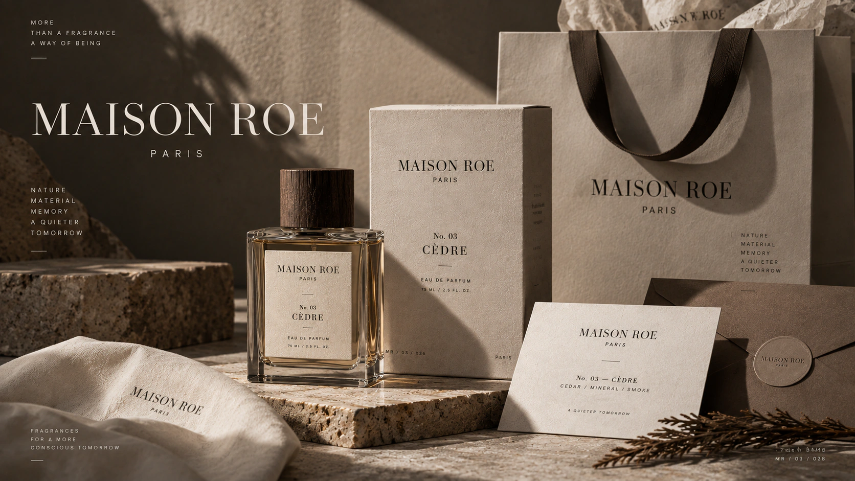
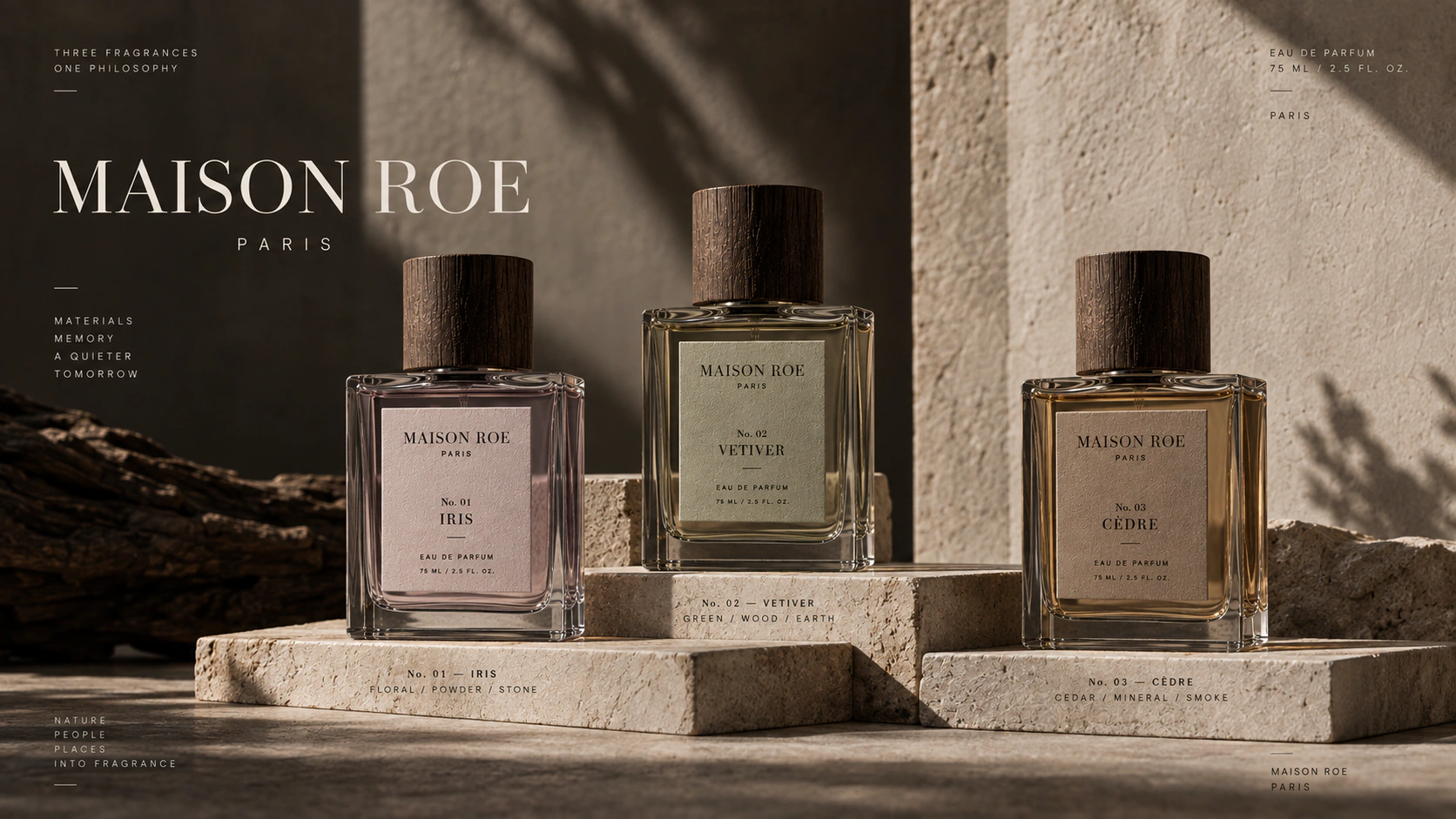
Maison Roe is a premium fragrance packaging and campaign study centred on the Cèdre product line. The supplied work applies the identity across bottle labels, cartons, cards, bags and product photography. The design needed to communicate material value without relying on ornamental luxury codes. A narrow palette, finely controlled serif typography and disciplined placement allow glass, paper, timber and shadow to carry much of the atmosphere. The resulting system keeps product information clear while giving every application a measured, tactile presence.
The brief
Create a fragrance identity that can move from a small bottle label to a complete packaging and campaign system.
The design brief was structured around the product applications visible in the supplied work: glass bottles, cartons, printed cards, a bag and image-led campaign compositions. Each format has a different material quality and a different amount of usable space.
The identity needed to signal care and value at close range while remaining recognisable when the product appeared within a wider photographic scene. Product information also had to remain ordered rather than becoming secondary decoration.
Designing for perceived value
Why does the direction remain restrained?
Restraint gives material, proportion and typography room to communicate quality without competing layers of ornament.
The visual language uses warm neutrals, deep brown-black tones and high-contrast serif typography. Fine rules and compact metadata introduce precision, while generous quiet areas allow the object and its materials to remain present.
This creates value through control. The design does not need a different premium device on every application because the relationship between type, spacing and material is already distinctive.
Packaging as brand architecture
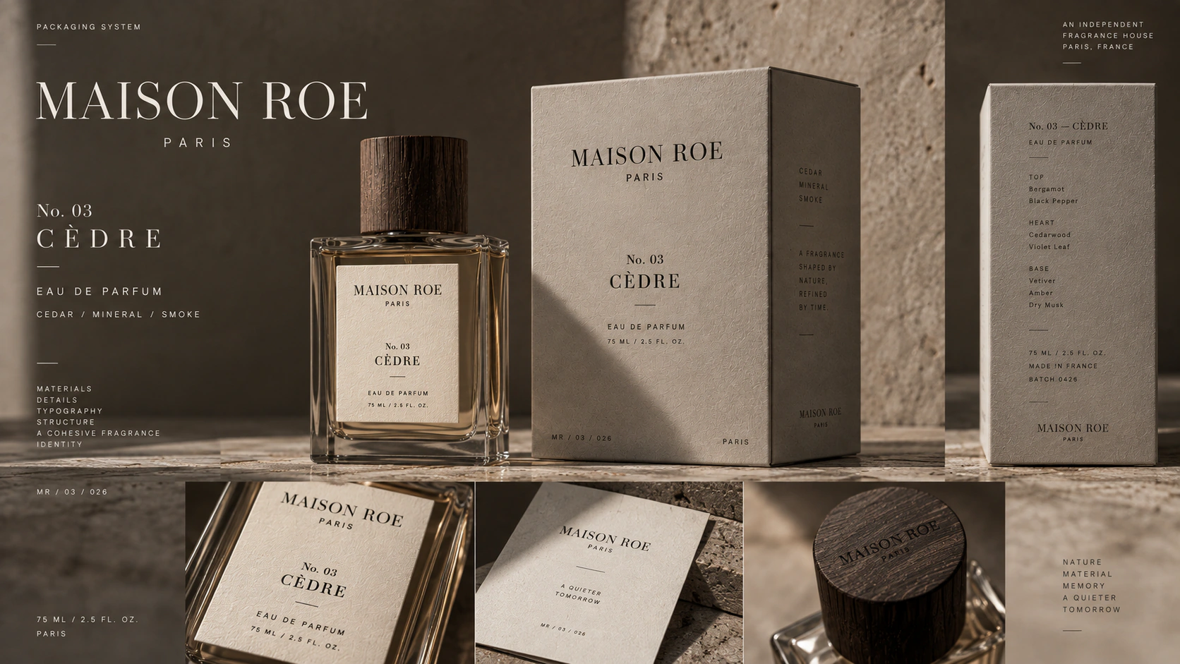
The bottle label establishes the smallest working version of the hierarchy: house name, fragrance, product type and supporting detail. That sequence expands onto cartons and printed pieces without changing its order.
Consistent alignment and scale relationships make the family legible as a system. Different objects carry different amounts of information, but the reader encounters the brand in the same order each time.
From object to campaign
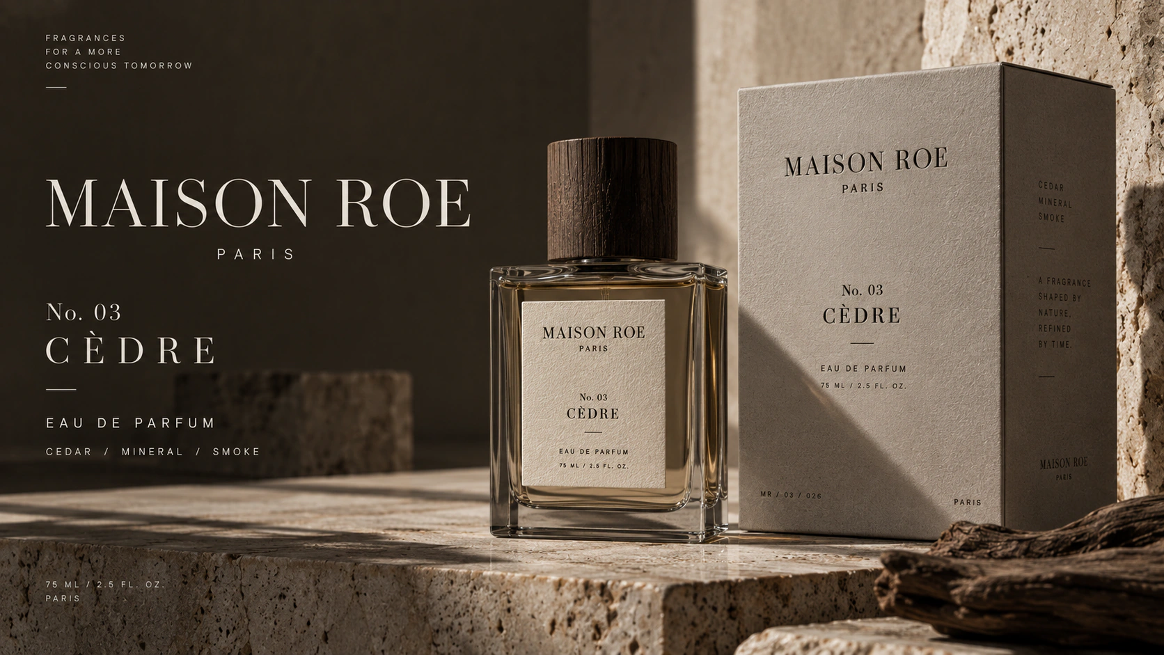
Campaign imagery extends the material logic rather than placing the product inside an unrelated visual world. Stone, timber, paper and directional light reinforce the restrained palette and give the bottle a clear physical presence.
Because the photography follows the same tonal discipline as the packaging, the identity can move from close product detail to a broader communication image without losing coherence.
What Maison Roe demonstrates
Perceived value is often created by what a system refuses to add. Maison Roe demonstrates how precise hierarchy, material sensitivity and controlled image direction can give a product family presence without turning luxury into ornament.