
Northline Architecture & Development
Graphic Design
An architecture identity organised around structure, material proportion and a system that moves from document to environment.
Northline Architecture & Development is an identity study spanning core marks, typography, stationery, presentation material, environmental signage and property-led communication. The work needed to feel precise enough for architectural practice while remaining flexible across intimate printed details and large physical applications. A modular wordmark, disciplined grid, quiet material palette and measured image treatment create a visual language built on structure rather than decoration. The system connects brand, document and place without requiring a separate concept for each touchpoint.
The brief
Create an identity capable of operating across architectural documentation, business communication and the built environment.
The design brief was structured around a broad set of visible applications: wordmarks, stationery, brand guidance, property imagery, exterior signage and event communication. The identity needed to remain credible at both document scale and architectural scale.
That required a system with more than a recognisable mark. Typography, spacing, colour and image use had to work together so every application could feel related even when the available surface, distance and purpose changed.
Building an identity with architectural discipline
Why is structure central to the direction?
A grid-led identity reflects the project’s architectural subject while providing dependable rules for documents, campaigns and environmental applications.
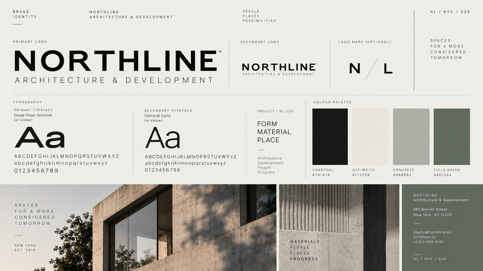
The wordmark uses deliberate spacing and a compact monogram to establish recognition without ornamental form. A muted material palette of black, bone, concrete grey and restrained green keeps attention on proportion, typography and architectural photography.
The direction borrows discipline from architecture rather than imitating buildings. Strong alignments, open margins and controlled scale create a sense of permanence that can survive different content conditions.
A system built on structure
The supplied brand guidance shows the system as a set of relationships: primary and abbreviated marks, display and reading typography, tonal roles and image placement. Those relationships make the identity repeatable rather than dependent on one polished composition.
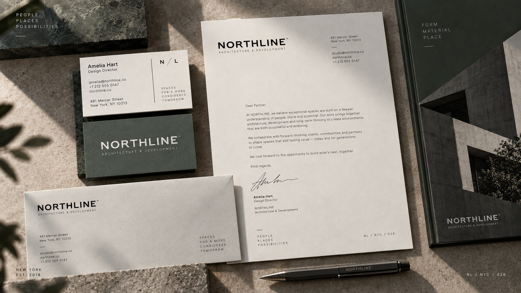
Stationery and presentation materials test the quieter end of the system. Fine information can remain legible and ordered because the same grid that carries the large brand mark also controls address details, document titles and supporting copy.
From brand to environment
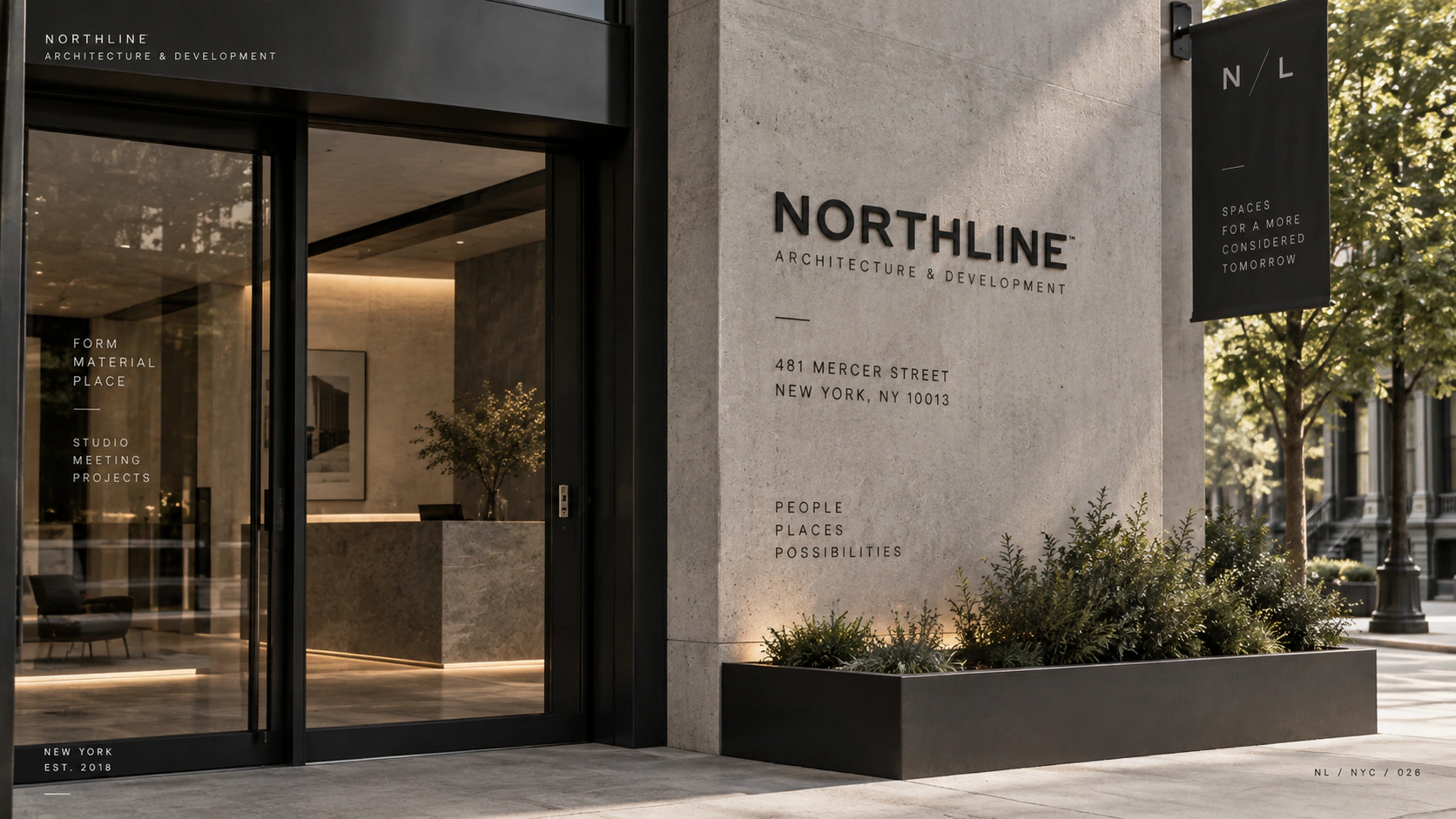
Environmental applications require the identity to hold its position beside real materials, light and architecture. The restrained signage does not attempt to overpower the building; it uses scale and contrast to establish presence while remaining part of the setting.
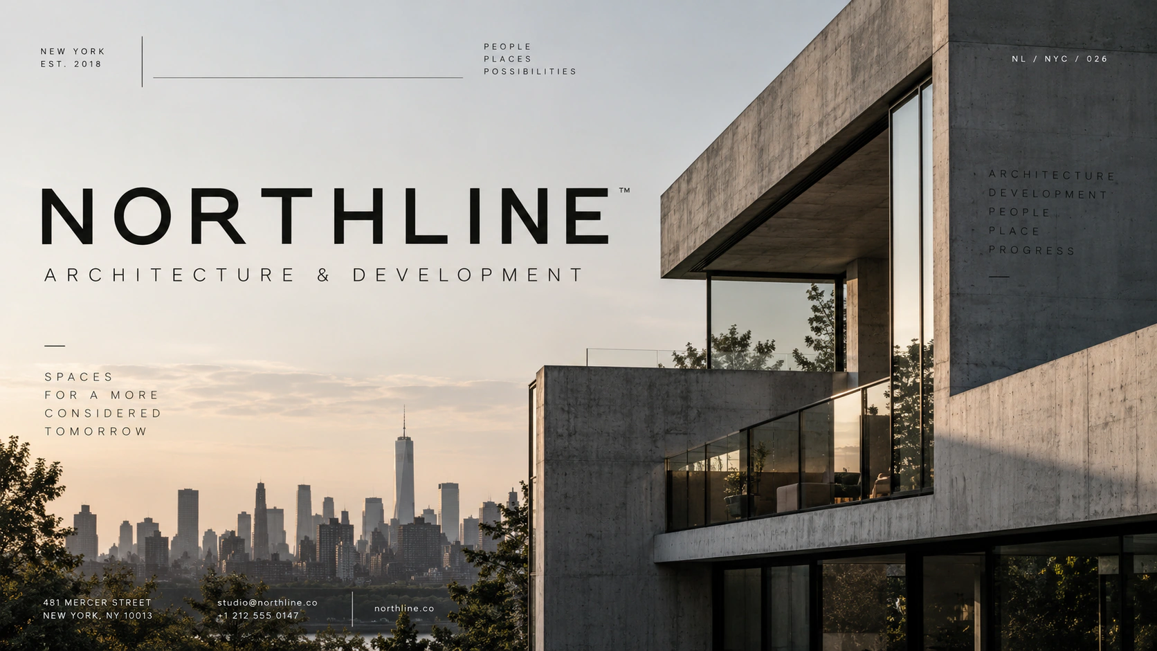
Campaign material extends the same principle. Architecture remains the visual subject, with the identity providing a consistent frame for names, events and supporting information.
What Northline demonstrates
An architecture identity earns credibility when its rules remain useful beyond the logo. Northline demonstrates how a clear typographic and spatial system can connect correspondence, presentation, campaign and place while allowing the architecture itself to lead.