
Field Notes
Graphic Design
An editorial system that turns architecture, interviews and urban observation into a publication built to continue.
Field Notes is an editorial design study centred on an architecture and culture publication. The work covers a masthead, cover system, contents architecture, long-form features and interview layouts. Its primary challenge is to establish strong issue-level recognition while giving different stories enough flexibility to develop their own rhythm. A high-contrast typographic hierarchy, modular page structure and measured relationship between image and text create a publication that feels authored at the cover and dependable through sustained reading.
The brief
Design a publication identity capable of organising different subjects, voices and image conditions across recurring issues.
The supplied work establishes Field Notes as an architecture and culture publication containing features, interviews, contents pages and image-led stories. The design brief was therefore larger than a single cover: it required an editorial framework able to support variation over time.
The system needed to make an issue immediately recognisable, guide readers through different content types and maintain clarity when pages moved between dense text, portraiture and atmospheric architectural imagery.
Hierarchy before decoration
How does the publication remain readable?
Field Notes uses stable typographic roles and column relationships so readers can identify story level, sequence and supporting information before they begin the article.
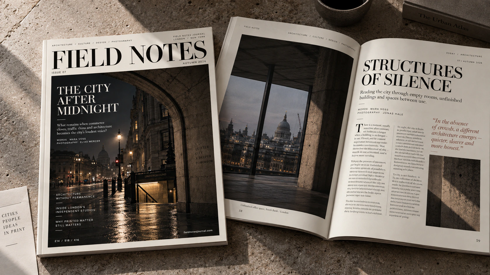
The masthead, feature headline, standfirst, body copy, pull quote and metadata each occupy a distinct register. Contrast comes from scale and type style rather than an excess of graphic devices, allowing dense pages to remain calm.
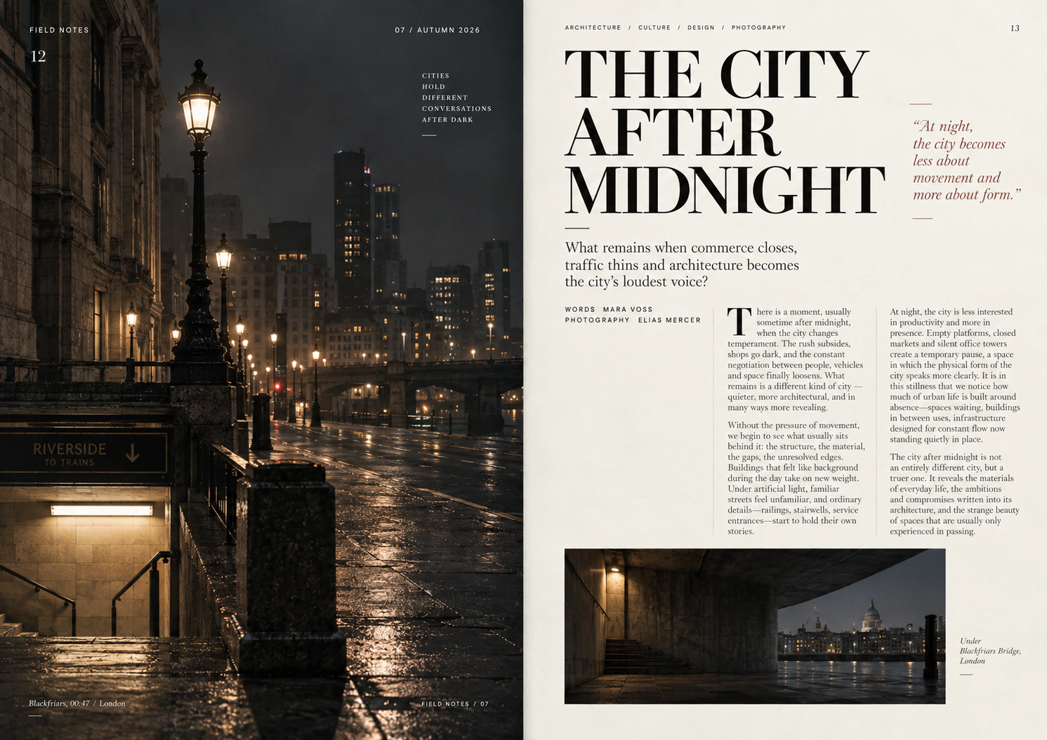
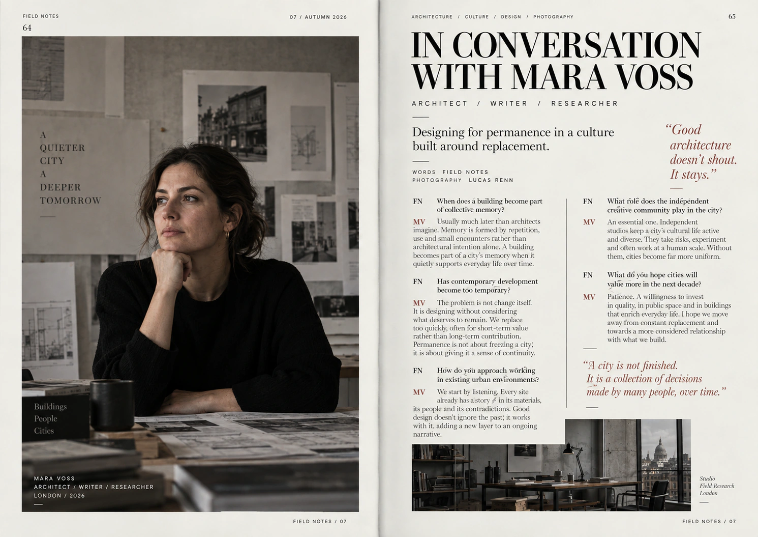
A modular column structure creates consistency beneath varied compositions. Stories can open with a dominant photograph or a dense interview page, yet recurring margins, baselines and information zones keep the issue coherent.
The cover as an editorial signal
The cover compresses the publication’s position into one encounter. A large serif masthead establishes authority, while the night image and limited secondary copy create atmosphere without obscuring the issue identity.
Inside, that same contrast becomes a reading tool. Large serif statements mark entry points; quieter text and fine rules organise detail. The system moves from immediate recognition to sustained comprehension.
A system built to continue
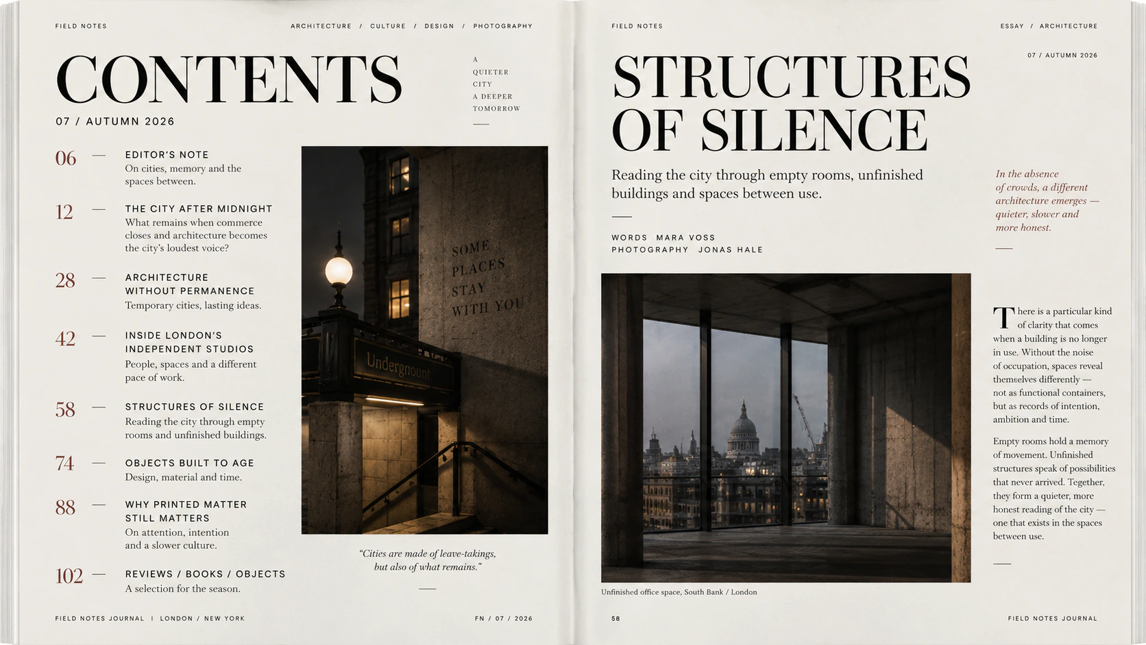
The contents page demonstrates the repeatable logic most clearly: number, title, image and supporting information occupy predictable lanes. Feature and interview pages then use those rules with different emphasis rather than abandoning them.
This gives future stories room to develop without requiring a new design language for every article. The publication retains a point of view while remaining capable of accommodating different editorial demands.
What Field Notes demonstrates
Editorial identity is not only a cover style. It is the sequence of decisions that helps a reader enter, navigate and remain with an issue. Field Notes demonstrates how recognition and reading rhythm can be designed as one continuing system.