
Aster House
Graphic Design
A hospitality identity in which menus, printed details and street presence share one warm, disciplined voice.
Aster House is a restaurant identity study developed across menus, table collateral, small-format print and exterior signage. The work balances the familiarity expected of a neighbourhood restaurant with a more considered editorial character. A warm neutral palette, high-contrast serif typography and compact supporting information create a system that feels tactile without relying on rustic cliché. The identity is designed to move naturally from the table to the street, giving food, place and written detail distinct roles within one coherent hospitality language.
The brief
Build a recognisable restaurant identity across the objects guests read, handle and encounter before entering.
The design brief was structured around the practical touchpoints visible in the supplied work: menus, table pieces, printed collateral and exterior signage. Each object carries a different amount of information and is experienced at a different distance.
The identity therefore needed a clear hierarchy rather than a single decorative motif. It had to support detailed menu reading, hold presence on the street and give small physical objects enough character to feel intentional.
Warmth without decorative cliché
Why was this visual direction chosen?
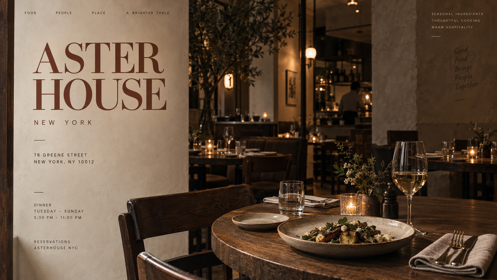
A restrained editorial direction gives Aster House warmth through material, food and atmosphere instead of relying on familiar hospitality decoration.
Cream paper, oxblood accents, dark timber tones and high-contrast serif typography create a sense of intimacy while remaining controlled. The palette complements the dining photography and natural materials rather than competing with them.
Typography supplies the recognisable voice. Large, elegant titles establish the name; narrow supporting copy handles schedules, menu information and address-level detail with precision.
The menu as a core brand object
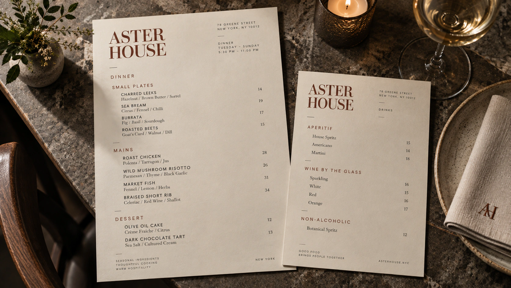
The menu is where identity and usability meet. Clear section changes, predictable alignment and a controlled relationship between dish names, descriptions and supporting information make the object feel composed without slowing down reading.
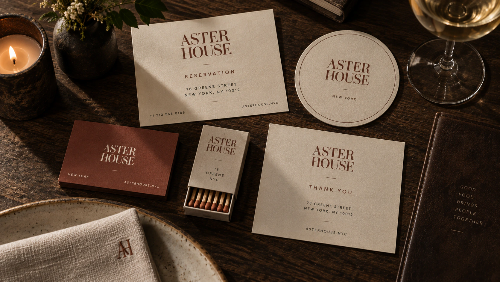
Because the typography carries both atmosphere and information, the menu can remain visually distinctive while still functioning as an everyday operational object. The same hierarchy then extends into smaller cards and table pieces.
From table to street
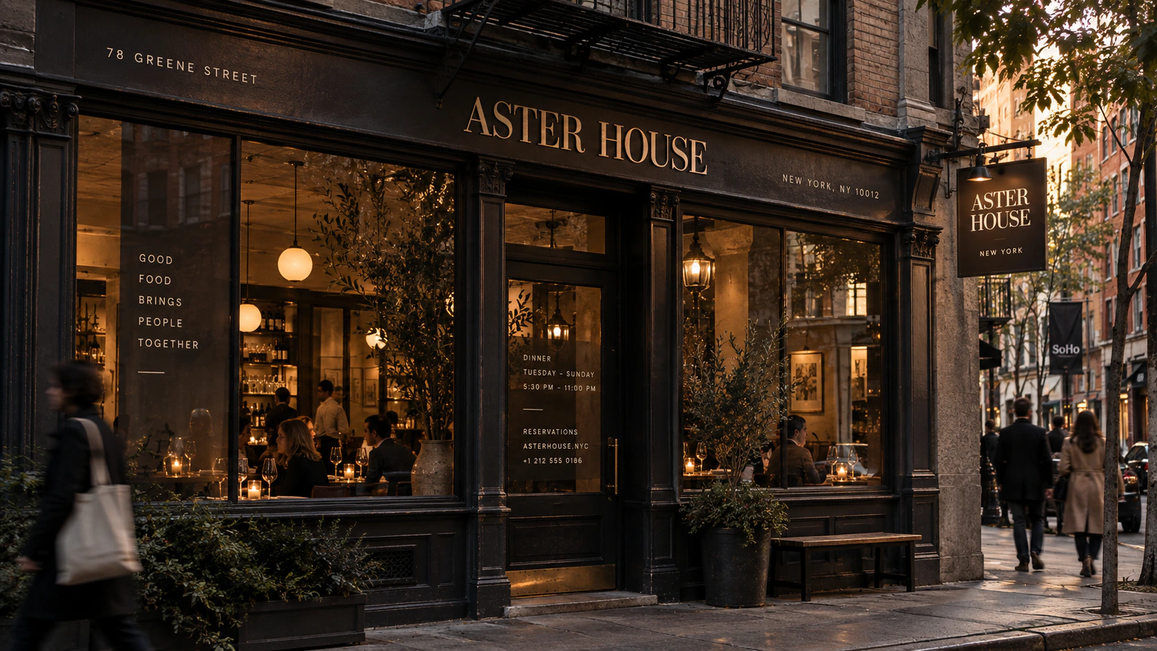
Exterior signage reduces the system to its most immediate elements: name, letterform and contrast. The restrained application allows the facade and interior light to remain part of the identity, rather than covering the environment with branding.
Across the full set, consistency comes from typographic roles, material tone and disciplined spacing. Different objects are free to respond to their use while still reading as Aster House.
What Aster House demonstrates
Hospitality identity is strongest when it improves the experience of real objects. Aster House demonstrates how one editorial system can guide a menu, a matchbook and a street sign without turning those touchpoints into repetitions of the same composition.