
Forty Seven
Graphic Design
A fashion campaign system built from controlled typography, directional image framing and repeatable editorial tension.
Forty Seven is a graphic design study for a fashion label, developed across campaign layouts, product-led editorial pages and large-format advertising. The work needed to give a varied set of garment images one recognisable voice without flattening the attitude of each frame. A restrained monochrome palette, condensed display typography and consistent information zones create the connecting system. The result is a campaign language that can move from a close product study to a street-facing billboard while retaining the same pace, hierarchy and sense of control.
The brief
Create a campaign identity able to hold together different images, garment details and publishing formats.
The design brief was structured around continuity. The supplied work moves between fashion portraiture, product information, material detail and large-format communication, so the identity needed to remain recognisable without imposing the same layout on every application.
The task was not to add decoration around the photography. It was to establish a clear editorial frame: one that could organise titles, collection references and supporting information while allowing the image to remain the primary source of attitude.
Creating a campaign language
What problem did the design need to solve?
The campaign needed to feel consistent across changing image proportions and levels of information without making every execution identical.
A limited black, bone and grey palette reduces competition between applications. Condensed uppercase typography creates a strong, repeatable signal, while fine technical copy gives product and collection information a quieter secondary register.
The contrast between monumental titles and restrained metadata lets the work change scale cleanly. A headline can command a billboard; the same hierarchy can contract into a product-led editorial spread without losing its identity.
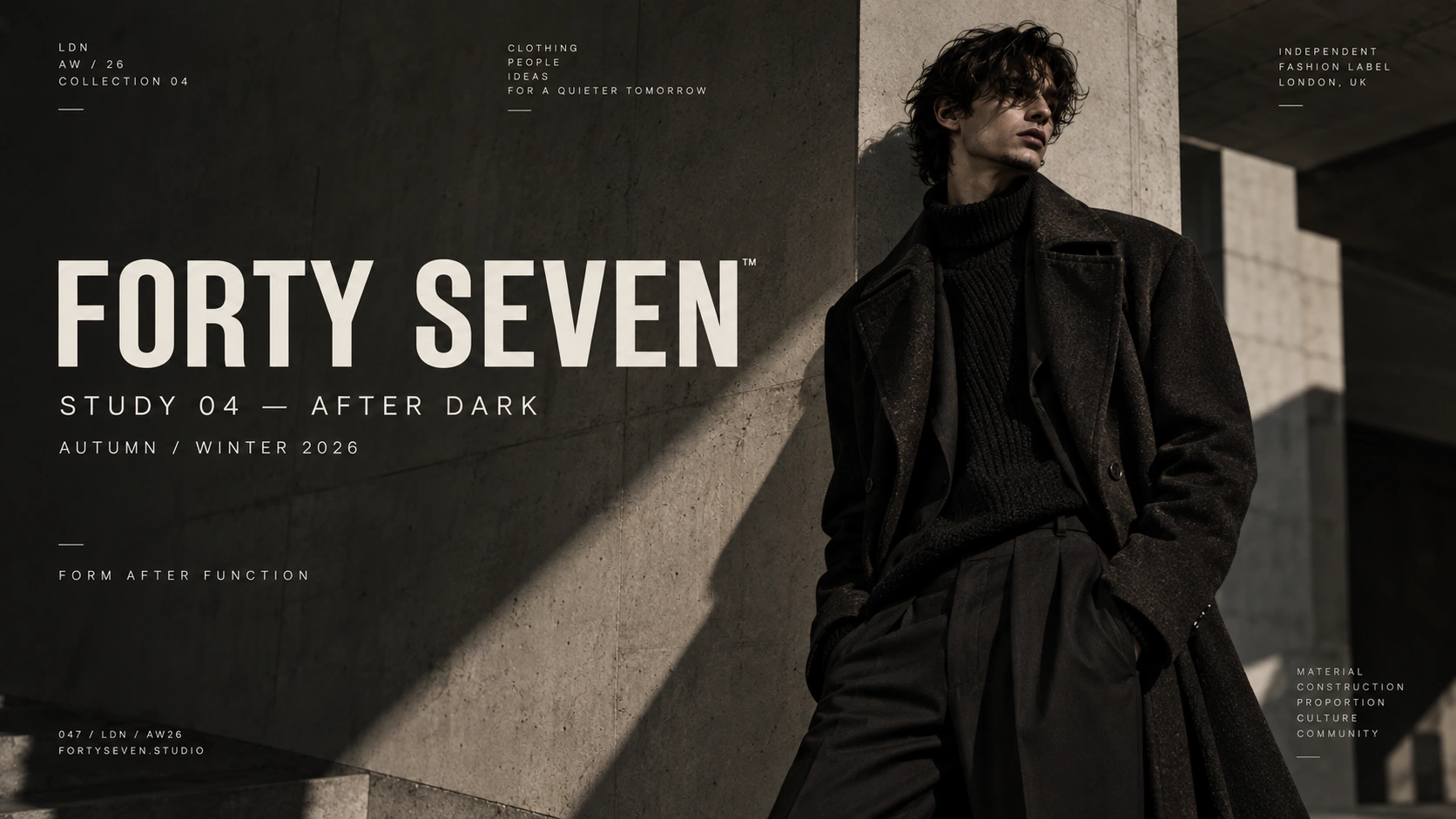
Image, type and attitude
Photography is treated as structure rather than background. Strong crops, directional shadows and generous dark areas create places for type to sit without weakening the image. The typography follows those photographic conditions instead of forcing a fixed overlay onto every frame.
This relationship gives the campaign range. Portraits can feel quiet and severe, product pages can become more informational, and close material studies can slow the pace. Recognition comes from the hierarchy and spatial rules shared between them.
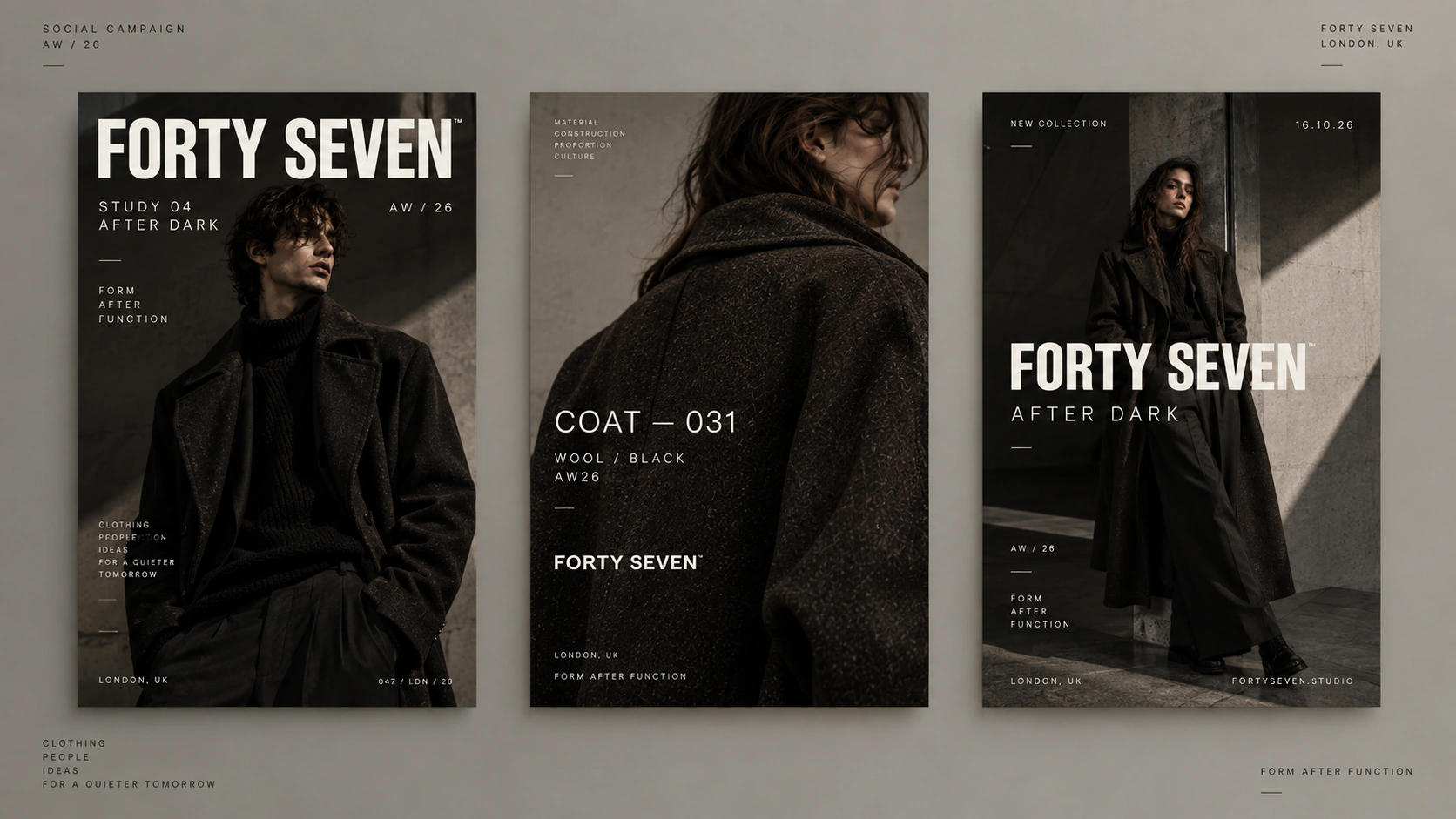
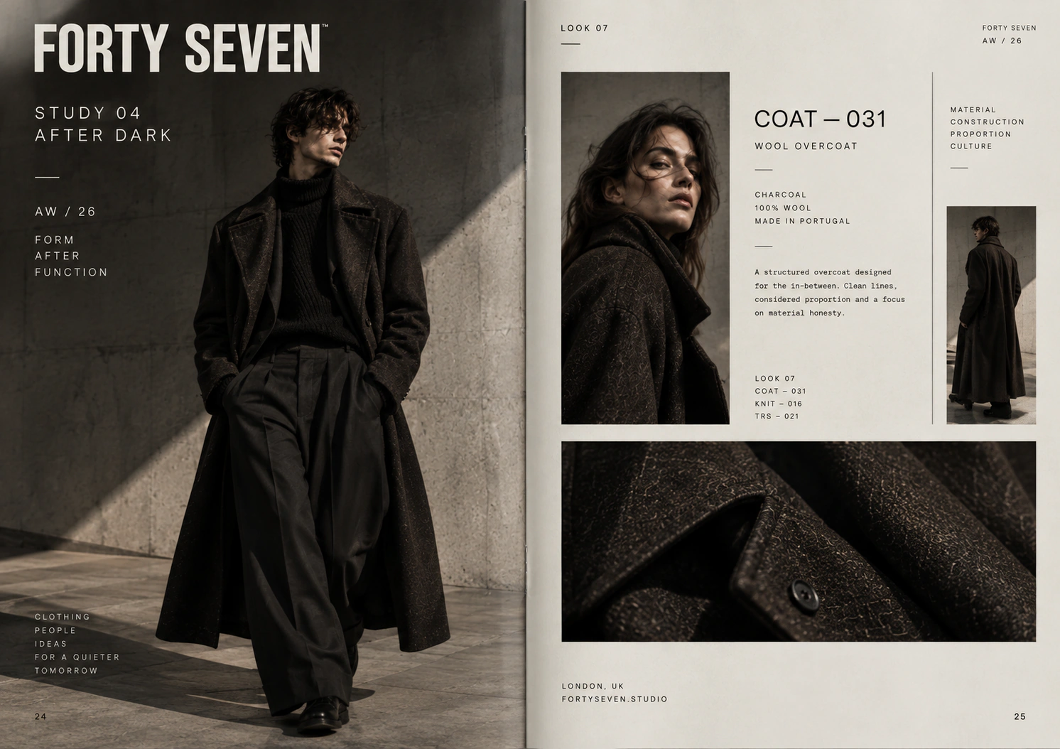
A system for multiple campaign moments
The application set tests the system at materially different scales. Editorial pages require fine information control; posters need immediate recognition; the billboard has only a brief moment to communicate. The same title treatment, tonal restraint and information logic remain visible in each condition.
Rather than creating a separate visual idea for every format, the campaign uses a small set of dependable rules. That makes the identity adaptable while keeping production decisions connected to one direction.
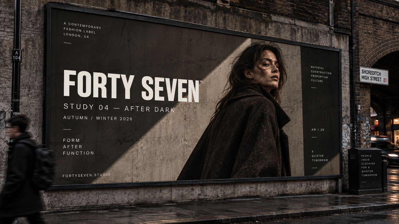
What Forty Seven demonstrates
A campaign system does not need to make every image behave the same way. It needs enough typographic and spatial discipline for different images to belong to the same thought. Forty Seven demonstrates how restraint can preserve both recognition and attitude across formats.